Showing posts with label Art class. Show all posts

Tuesday, February 18, 2014

Fall in Woodcut

Trying to make sure I post all the artwork I haven't shown yet!

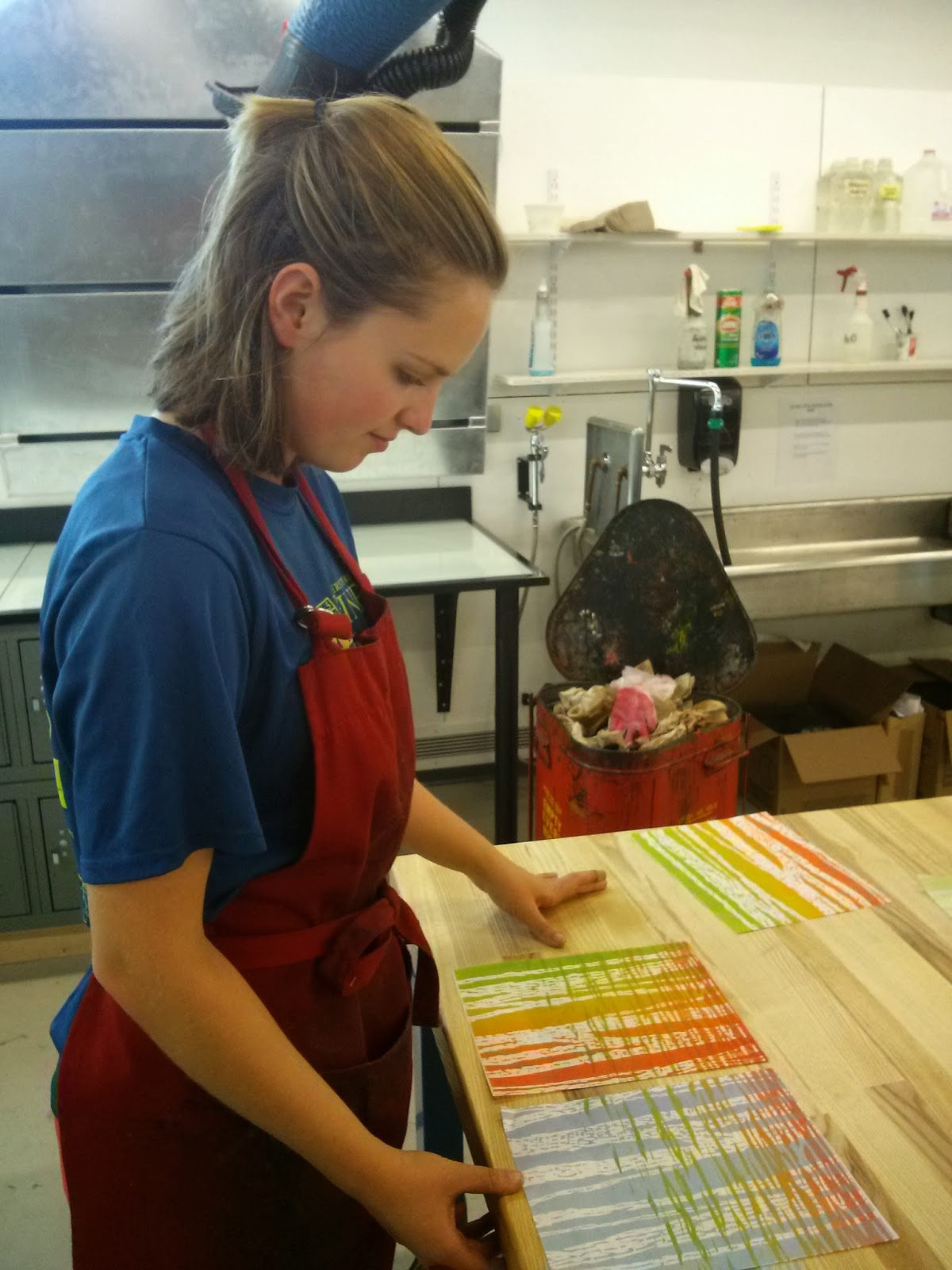
I had a lot of fun making a bunch of fall-themed woodcuts in printmaking last semester. I was inspired by the beautiful views hiking Katahdin, particularly the fade from warm red-oranges to yellow-greens of the leaves on all the birch trees. I mixed and matched the woodcuts to get a variety of prints. 

I would love to continue working with these blocks and make more prints!


Tuesday, February 11, 2014

Fjord Features


This image was done for our "mapping assignment". I like finding similarities between people and our environment, so I was inspired by the beauty of fjords (an aerial view), steep glacial carved valleys, and the permanence of these features, which are akin to the way our lives are carved by events and forever changed, or scarred. 

I decided to try polyester plate lithography in printmaking last semester. I have always loved the look of many litho prints, the way you can get carefully rendered images, like those of M.C. Escher.  Polyester plate is a newer technique, where you can "simply" just draw onto the plate with litho crayons, light and water fast markers (like micron, sharpie) and then put the polyester plate onto a hot plate to fuse the crayon or maker to it.  

The trickiest part is printing this plate. It works based on the opposing relationship of oil and water. Whatever you drew attracts the oil in the litho inks, so you sponge the plate withwater (and some gum arabic, won't go into) and then roll out your ink, and it should only stick where you drew! It should also  stick more or less depending on how dark you drew, so shading should come out. I had a ton of trouble with my light shading being removed, and had to re-draw the plate with the face on it (I had 3 plates, one for each color) 5 times, and the gradation still did not come out nearly as nicely as I would have liked!


Had to make a bunch!

Two color layers: some light brown and light blue


My drawing with litho crayon on the polyester plate

The result... Not quite what I drew

Result after re-drawing many times, about as good as I could get


Yay, kinda decent prints finally!

Ghost print of the face plate


Saturday, June 22, 2013

Relief Printing multi-color


The second linoleum relief print we made was done multi-colored in what is called the "suicide" style because you cannot fix a mistake (un-carve something) in the very particular process. In order to make sure we understood how to go about this our professor had us sketch each color layer on a sheet of tracing paper.

These are some prep sketches of for my idea. The theme of this assignment was ephemeral, so I was thinking about the way we consider time. We often consider rock as permanent, while in reality it weathers and crumbles, as did the Old Man of the Mountain. 
It all depends on the timeline being considered, there is no one way to define a short or long amount of time; So, I compared the life of a human compared to the lifespan of a cliff.


I made 8 prints trying out different color combinations. Each color is one layer of linoleum that I carved away after printing.


We had the option of waxing some of our prints if we chose, after the ink completely dries. 


This print is my favorite

I tried printing the purple shadows and green trees before the blue background was dry enough (it takes closer to 2 days to try between ink layers) so the ink of the sky lifted up a bit.


Friday, April 19, 2013

Silent Spring Illustration

I had plans to go and watch The Joy Formidable perform in Boston today at the House of Blues however since all of Boston is currently on lockdown, and the show is postponed until June 20, I am just at Jackson's house for the day (we were going to take train into Boston from Portland). So I have the free time to post finally!

I have been taking printmaking this semester, it's a very time consuming class, but I really enjoy the challenges (..most of the time). 

After working on etching copper plates, we have been doing relief printing with linoleum. Next up.. screen printing! Hopefully it will be a bit of fresh air from all of the work of etching and then carving.


My sketch for the linocut.. I had to consider that everything would be carved and simply in chunks of black or white.

For the Honors College course I am taking we had a project/paper due recently. I chose one of the texts we read this summer, Rachel Carson's Silent Spring, to do an artwork and short writing piece on. I loved this book, the powerful way it is written, and the message it presents. I chose printmaking as the medium because of the chemicals that are often used in certain processes.


I transfered my sketch onto my piece of 8" x 8" linoleum with carbon paper 

The "carving booth" I set up in my room, it actually worked out really well!

All carved away.. oof lots of work.. about 4-5 hours


This is the portion of my paper that described the meaning of my artwork.. it is lengthy but I wanted to explain this thoroughly!
            My artwork is inspired by Rachel Carson’s revolutionizing stance on the deception of the chemical companies. This piece is meant to be illustrative: capturing events that occurred and their consequences in a manner that those who do not understand the harm of pesticides may not have considered. A man in a suit whose face is concealed by a gas mask is confronting a young boy. The man is meant to represent an employee of the chemical industry who sells products such as DDT. His hidden face alienates the boy by hiding the identity of the man who seems to be playing the role of doctor. The suit indicates that he is not as this role implies, only a wealthy man looking for profit despite the expense. The gas mask is a cruel reminder that he is knowingly killing with DDT, deceiving the public while ensuring his own safety. The boy embodies generations to come, evoking sympathy from those who wish to keep the planet healthy for the sake of the children and grandchildren who will inherit it. Life springs from the boy: a tree sprouts from his back, flowers bloom in his hand, a bird tweets on his head, and a fish jumps from the stream flowing along his hips. This is meant to emphasize that the entire ecosystem will be affected as soon as we introduce chemicals into it. These synthetic substances will not lie dormant, they will transfer from the crops to the rivers, the insects, birds, animals, and inevitably to mankind. The man is directly injecting the boy with DDT, a challenge to people that this is essentially what we will be allowing to happen to our children if we accept the use of such toxic chemicals in our environment. Around the injection site the DDT spreads through the boys veins, appearing to be a system of black, polluted rivers on his arm. Leaves are already beginning to fall from the tree; the bird may not be joyously singing, but crying in pain and protest. The stream is already coursing with ribbons of black, the fish perhaps jumping from its beloved waters to escape; the flowers are uprooted from the soil, presented to the man by the boy as if to say ‘Look at the harm you are doing’. The color choice is simply meant to show the black and white rigidity of industrial power: you are either rich and important or poor and insignificant. The chemicals the man sells will suck the color from the world as they devastate nature. The boy’s healthy color is fading around the injection site, indicating that the bright pallor of skin will soon subside to white. The effect of the use of black through the printmaking processes is a reminder that in order to create art under this discipline, certain materials must be used. The same is true for the use of pesticides: but people must do everything in their power to prevent the most harmful chemicals from being distributed, and employ the safest methods of using them possible, despite cost or inconvenience.


Saturday, November 3, 2012

Painting class

This semester at school has been very busy with classes and my work study in the art department, but I have been having some great experiences. In my Painting 1 class we have been working with temperature a lot, as well as trying different painting styles and brush strokes.

First assignment: White paper and object still life with only black and white paint. 

Monochromatic still life, Split-complement close-up of one object

Complementary still life, Analogous painting of one object 
Two one hour still lifes using temperature: kitchen utensils, and spoon in glass vase

One hour still life of boots and hose using temperature


One hour still life of dinosaur toys using temperature

Model, using temperature


Model, using temperature


Friday, May 18, 2012

Set sail for the kingdom


I'm looking forward to bringing everything I experienced in my first year at UMaine into various projects over the summer. I will definitely be making art in my free time as per usual, and I have been getting some comic-drawing books at the library to work with, but I am excited to see what I can do with some of my new or increased skills gained through my art classes! Especially in terms of my glacier sketches when I head out to the North Cascades for the 4th consecutive year in August!
Below is a progression of glacier sketches from the 5.5" x 8.5" sketchbook I have brought with me the past 3 years, as well as some of the works I have completed once at home!

Talus and cliff view from campsite at Columbia 7/27-28/09

Lupine by Columbia 7/28/09 - Day 2 of my first glacier trip!

View from ridge above Columbia campsite, looking towards Blanca Lake. I started and did a lot of this my first field season, on 8/29/09, but I continued it my second year, on 8/3-4/10!

Rock with flowering heather growing up the back, at the Easton glacier campsite.

View from our Sholes and Rainbow Glacier's campsite on Ptarmigan Ridge.

Camp Kaiser, near Mt. Baker, on Ptarmigan Ridge. I started this my first year on he glaciers, and continued it on the second, although there was much more snow and ice the second year!

Mokey Paw sketch at the Columbia campsite, 8/2/10.

A sketch I started off our tents in the foreground and Mt. Baker in the background, at the Rainbow/Sholes campsite.

Michael's Sword, a pinnacle on Daniels, I observed it from the Iceworm Glacier.

The third field season I experimented by bringing up a small set of watercolors instead of colored pencils. I liked it more for some subjects, such as flowers, and showing snow, ice, and water, but showing the rock and trees with paint was more difficult for me.

After we worked on the Lower Curtis Glacier on Mt. Shuksan I painted some of the flowers nearby - some variations of small, purple Phlox, narrow, purple Penstemon, and my favorite, the bright orange Indian Paintbrush!

I painted this from Lyman glacier, the area surrounding the water is actually rocky, but I liked the form of the ice on the water on its own.

Below is artwork I completed for my AP art drawing portfolio (the concentration section) my senior year in high school, in random order.

Enjoying Mt. Baker from a nearby ridge, the beauty and serenity one feels in this sort of place is represented by the magical flowers.

The same hiker returns, but now the glacier has receded greatly, and exposed bedrock and blue ice, as well as run-off streams, have resulted. The mountain and its glaciers are still incredible, but their dwindling power and presence decreases the natural beauty, and thus the magic that causes the flowers to grow.

The glacier's on Mt. Baker are all gone, and although the mountain is still awe-inspiring, it is nothing compared to what this hiker saw as a girl, and the same magic is no longer there.

I painted this after my first field season in the North Cascades, looking up from just below the base of Columbia Glacier. 2009

I didn't end up including this in my AP concentration, but I did put it in the breadth section. It is a view of what Columbia glacier may look like once it has melted away, with two lakes, and bedrock that has not yet begun to  grow much plant life. It is beautiful, but not in comparison to the glacier. I like the contrast between the top one done in acrylic paint and this piece done in watercolors. 

This piece was also in my breadth section, it is a cropped view of one of my crampons that I wear over my hiking boots while climbing on glacial ice.


An illustration of me, jumping over a crevasse! I showed the layer of snow accumulation seen in the crevasse, but this piece as meant to be more illustrative than exact or scientific in any way.

I painted this  for my dad's birthday in October after my second field season! It shows him in the foreground, making his way up the Lynch Glacier on Mt. Daniels! In the background we can see members of the documentary film crew that followed us around that year!

My nordic skis, their Peltonens, gliding through the snow like magic!

Snow girl! she represent me, seeing snow as beautiful, represented through the magical plants around her. On the bottom the growth is shown: as the snow picks up, the plants grow taller and bloom.
Snow girl walking through the new fallen snow. The idea that she and the snow together form the magic is shown through the growth the of the plants which spring and then bloom as she approaches.

Snow girl portrait
She is painting the snow back onto Mt. Baker, giving its glaciers life and a positive mass balance!

This year at UMaine I was taking all the beginner art courses: Drawing I and II, 2d and 3d design. So, I didn't do much art that wasn't observational, or pretty regulated by my professors, but I learned a ton. Our last project for Drawing II, which we worked on in and out of the classroom, was a landscape diptych or triptych. I chose to do two views of glacial spots that went well together!
Iceworm Glacier

Camp Kaiser


The diptych!