Showing posts with label artwork. Show all posts

Tuesday, February 18, 2014

Fall in Woodcut

Trying to make sure I post all the artwork I haven't shown yet!

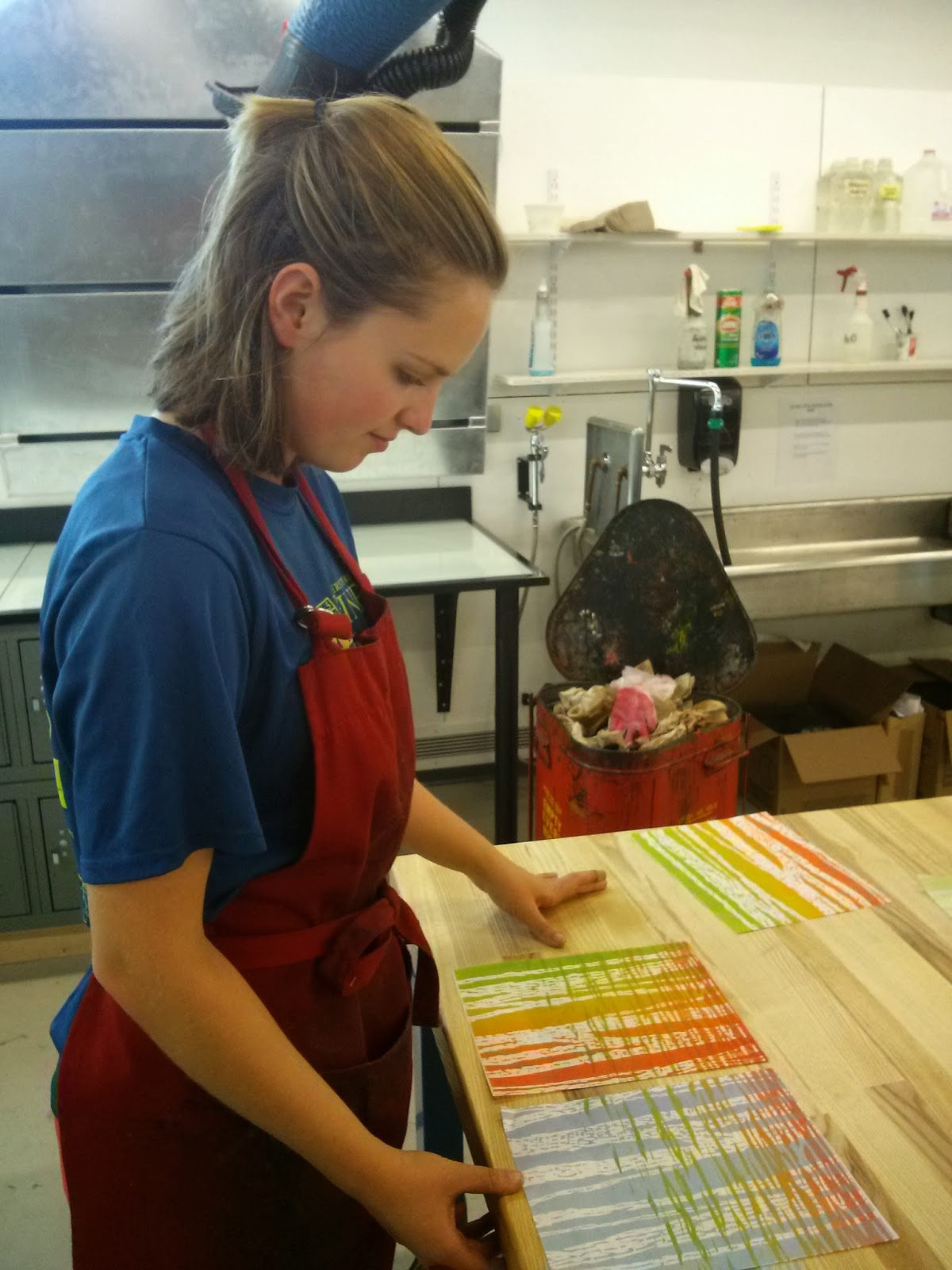
I had a lot of fun making a bunch of fall-themed woodcuts in printmaking last semester. I was inspired by the beautiful views hiking Katahdin, particularly the fade from warm red-oranges to yellow-greens of the leaves on all the birch trees. I mixed and matched the woodcuts to get a variety of prints. 

I would love to continue working with these blocks and make more prints!


Friday, August 30, 2013

My 5th Glacier Field Season

Beautiful lil paradise! Bright green moss on the rock face covered with yellow and pink monkey flower 


This summer was my 5th field season working with the North Cascade Glacier Climate Project, and my second summer taking my own measurements of crevasses in order to observe their changes in accordance with the retreat of the glaciers.

Here are some photos of this field season! Next post I will show my field sketches from this summer!

A got a grant through the Center of Undergraduate Research at UMaine, and used it to buy a laser rangefinder (to shoot distance, height, inclination), the cam-line I am using here (intended to measure well depths, a steel cable with markers every foot for measurement. I used it to measure crevasse depths!!), and most of my plane ticket out here.
Watercolor near the terminus of the Lower Curtis glacier on Mt.Shuksan
Trudging back to camp after a long day of working on the crevasse-ridden Rainbow glacier (behind me)
Hike out of one spot - hike into another!
Descending the blue ice near the terminus of Easton glacier on Mt. Baker
Watercolor and colored pencil sketch of this pool at the terminus of the Iceworm glacier.
Mountain goats - I have a neat post about them coming up! These guys are very elusive, you can't get near them usually.
Ben using a rope to measure the depth of the snow accumulation from the past winter (crevasse stratigraphy - like tree rings!)
Checking out a lil water-filled crevasse on lower Rainbow glacier
Partway through a sketch of camp below Easton glacier
Working on Easton glacier

Tuesday, July 2, 2013

Toned paper


I really enjoy working on toned paper; it is nice to not have white as a base, because then it can be used as a strong highlight. The portrait above is just a sketch I did this past semester while at art club. Little stars surround her and she begins to become one with the sky


Monday, July 1, 2013

Stormy character


I have been devoting time each day to work on something, only about 4-6 hours, sometimes more when there is a project I really want to get done. Whether it is a sketch, a submission for DesignCrowd, a blog post, or reading about glaciers for my research project, or planning out the thesis project I will need to complete before I graduate from UMaine.

I think it is important to take advantage of time I have during this summer, and still enjoy it of course!

This character is done on a nice grey toned paper. After a pencil sketch I inked her with fine tip pens and then used a black colored pencil  to shade her face and used the wonderful tool sharpie paint extra fine point white pen to add the highlights. 


She is meant to look fierce and stormy


I like the character just in grey-tone so I photographed her at this stage before adding purple hair


A different version from photoshop, as is the figure at the top with mermaid sea-green hair


Saturday, June 29, 2013

Longboard


Most days I longboard to get around the UMaine campus. This summer I decided to decorate the bottom with markers, pen, and acrylic paint. Before doing this, I sanded the surface, and then afterwards put a clear finish back over. 


Friday, June 28, 2013

Portfolio

Character illustrations

This summer I have been working on my portfolio: organizing it, presenting it,  and adding to it. I decided to create an account on Carbonmade: http://jillpeltoart.carbonmade.com/ and I have also been creating submissions for the contest website DesignCrowd.


Pirate in pen and watercolor

One of my birthday presents for Jackson. A watercolor and pen illustration of us and the many adventures we have.

Tuesday, May 7, 2013


The second project in printmaking is relief printing. We had to do two linoleum carvings.
The first project we could only use black ink, and the purpose was to show a sense of light.

I chose to do an image of my sister Megan and I that had great lighting.


 I used carbon paper to transfer the outline of the areas I wanted to cut away onto the linoleum.
Our faces reminded me of two glowing moons in this early stage!

I did some more detail for a mix of marks and gradation on Megan's face. I used all little horizontal marks for her face.

I tried running the linoleum through the press a second time without applying more ink and I like the grey tone

More marks, I used all small vertical marks on myself

One of my final prints - I had a lot!

I waxed some of them... makes light go through them, although this paper is pretty thick. However you DON'T want to to keep this out in sun because the wax can melt 

I waxed this final print as well.. it is a thinner paper with threads


Monday, May 6, 2013

Printmaking .. The Beginning

I feel like it is best suited to say I survived printmaking with my sanity! No, it was an awesome course and I am beyond happy to have learned what I did and gained the skills I now have. It is a class that requires hours upon hours of work in the studio however and much of it feels not artistically challenging but simply grueling.

I will do a couple of posts of the different types of prints we made.

To orient everyone with the print shop and the printing press the first week we simply did ink transfer print. Laser prints or photocopies have ink that can transfer. We applied wintergreen oil to these images we chose and ran them through the press on paper to come up with simple locker designs.


Our first project was etching 2 copper plates. My first was of a mountain scene with textures that were meant to appear like multi-faceted rocks. I guess somewhat illustrative..
I had around 10 prints of this image

Proof 1 
Simple line work to get the basic outlines

Proof 2
Gradation added for depth

Proof 3
More line work detail was done. My plate had been oxidizing so it foul bit (the acid attacked it) but I think the mistake added much more depth to the image.. one side of the mountain looks so much more in shadows.

One of my chosen favorites. It looks somewhat like an old photograph


We use the middle printing press

The Mordant room... eye and hand protection is needed in here because we work with acid to bite the plate and a strong base to remove any ground we apply

Working on my image in the beginning

My first sketch on the plate before I did any line work