Showing posts with label printmaking. Show all posts

Tuesday, February 18, 2014

Fall in Woodcut

Trying to make sure I post all the artwork I haven't shown yet!

I had a lot of fun making a bunch of fall-themed woodcuts in printmaking last semester. I was inspired by the beautiful views hiking Katahdin, particularly the fade from warm red-oranges to yellow-greens of the leaves on all the birch trees. I mixed and matched the woodcuts to get a variety of prints. 

I would love to continue working with these blocks and make more prints!


Tuesday, February 11, 2014

Fjord Features


This image was done for our "mapping assignment". I like finding similarities between people and our environment, so I was inspired by the beauty of fjords (an aerial view), steep glacial carved valleys, and the permanence of these features, which are akin to the way our lives are carved by events and forever changed, or scarred. 

I decided to try polyester plate lithography in printmaking last semester. I have always loved the look of many litho prints, the way you can get carefully rendered images, like those of M.C. Escher.  Polyester plate is a newer technique, where you can "simply" just draw onto the plate with litho crayons, light and water fast markers (like micron, sharpie) and then put the polyester plate onto a hot plate to fuse the crayon or maker to it.  

The trickiest part is printing this plate. It works based on the opposing relationship of oil and water. Whatever you drew attracts the oil in the litho inks, so you sponge the plate withwater (and some gum arabic, won't go into) and then roll out your ink, and it should only stick where you drew! It should also  stick more or less depending on how dark you drew, so shading should come out. I had a ton of trouble with my light shading being removed, and had to re-draw the plate with the face on it (I had 3 plates, one for each color) 5 times, and the gradation still did not come out nearly as nicely as I would have liked!


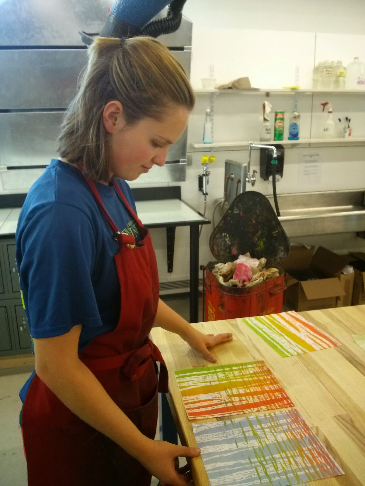
Had to make a bunch!

Two color layers: some light brown and light blue


My drawing with litho crayon on the polyester plate

The result... Not quite what I drew

Result after re-drawing many times, about as good as I could get


Yay, kinda decent prints finally!

Ghost print of the face plate


Tuesday, February 4, 2014

Portraits of Threatened Species


Last semester is Printmaking 2, I chose to try monoprinting for my final project (we could chose any print technique, and any idea). I had gotten very frustrated doing polyester plate lithography for my previous project (will post about soon!) and wanted to try something new! 

Monoprinting can be refreshingly straightforward for a print technique, it would appeal to someone who loves to paint (like me!), however you of course get only one print out of each go! I only used black ink, so I simply rolled it over my piece of plexiglass then took it off to bring out whites! The ink was water based which means it can be more easily removed. I used Q-tips to draw each of these animals because for some reason that fluffy tip is perfect for picking the ink up (and they can be dipped in water to get a really nice white). It is tricky to not remove too much ink too soon!

I chose to do prints of four large North-American animals that have been in trouble recently: threatened, endangered, etc. I did them in portrait-style with their eyes meeting the viewers so it would seem both more confrontational and accusative, and also more akin to a portrait of a person. This is supposed to send the message that it is our fault these animals are struggling, and we should value the health of their species more highly (as we value our own species). 

The four animals I chose

Working on the bighorn sheep!

The wolf
The mountain lion in progress

Bison in progress 


Saturday, June 22, 2013

Relief Printing multi-color


The second linoleum relief print we made was done multi-colored in what is called the "suicide" style because you cannot fix a mistake (un-carve something) in the very particular process. In order to make sure we understood how to go about this our professor had us sketch each color layer on a sheet of tracing paper.

These are some prep sketches of for my idea. The theme of this assignment was ephemeral, so I was thinking about the way we consider time. We often consider rock as permanent, while in reality it weathers and crumbles, as did the Old Man of the Mountain. 
It all depends on the timeline being considered, there is no one way to define a short or long amount of time; So, I compared the life of a human compared to the lifespan of a cliff.


I made 8 prints trying out different color combinations. Each color is one layer of linoleum that I carved away after printing.


We had the option of waxing some of our prints if we chose, after the ink completely dries. 


This print is my favorite

I tried printing the purple shadows and green trees before the blue background was dry enough (it takes closer to 2 days to try between ink layers) so the ink of the sky lifted up a bit.


Tuesday, May 7, 2013


The second project in printmaking is relief printing. We had to do two linoleum carvings.
The first project we could only use black ink, and the purpose was to show a sense of light.

I chose to do an image of my sister Megan and I that had great lighting.


 I used carbon paper to transfer the outline of the areas I wanted to cut away onto the linoleum.
Our faces reminded me of two glowing moons in this early stage!

I did some more detail for a mix of marks and gradation on Megan's face. I used all little horizontal marks for her face.

I tried running the linoleum through the press a second time without applying more ink and I like the grey tone

More marks, I used all small vertical marks on myself

One of my final prints - I had a lot!

I waxed some of them... makes light go through them, although this paper is pretty thick. However you DON'T want to to keep this out in sun because the wax can melt 

I waxed this final print as well.. it is a thinner paper with threads


Monday, May 6, 2013

Printmaking: Copper Plate #2

One of the hardest things about printing is that it is often unpredictable. It is not nearly as controllable as many mediums and hours of work can go to waste. 

For our second copper plate etching project we had to use a photopolymer layer as a ground. By placing objects on the plate with the layer and shooting intense UV light down on the plate, the 'shadows' of the objects are left. I chose a multitude of pebble I found on campus.

Sketch #1 
This first proof has a sketch on it of what I could potentially add to the print. It looks sorta like outer space to me

Sketch #2
This was meant to look like lava: where the rock once originated
Sketch #3
This segmentation made me think of a conglomerate rock 

I used melted crisco to get this splattered affect.. unfortunately despite hours of work the rocks got almost completely lost


I added a bit of turquoise to this print.. and a wash to try and make the rocks show up a bit more